Channel
Logo Creation
Visual Identity
Brand Design
Role:
Channel was built to serve – both their customers and their employees. To continue to deliver top quality service they united their 10 regional seed brands under the new enhanced Channel brand. This new horizon for Channel lead to the creation of a new logo that both showcasing we’re they’ve been and give them a clear direction forward.
The step in uniting these brands was huge for Channel. They need their farmers and their employees to know they weren’t getting left behind. To demonstrate their dedication the new logo needed to pack in a lot of meaning.
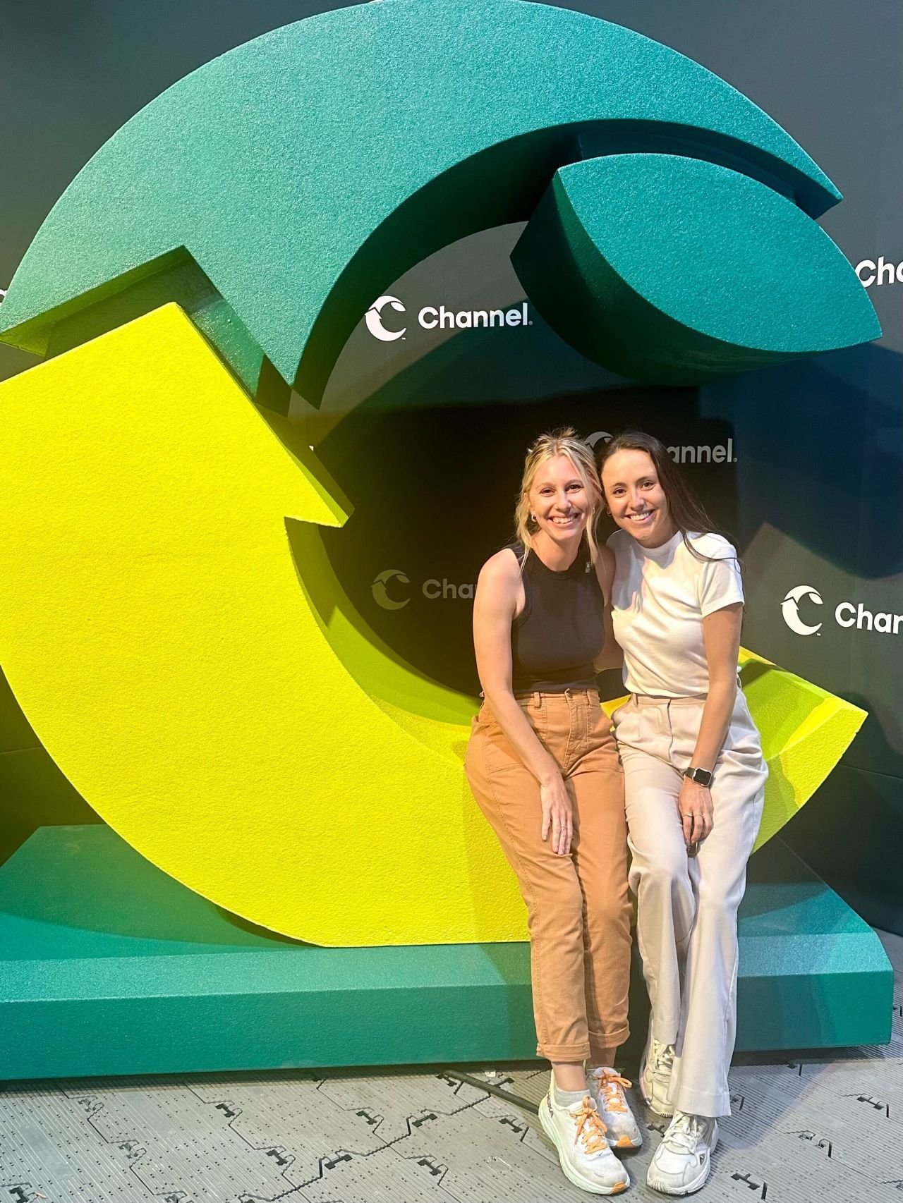
In every curve, point, or color there was an underlying strategic decision. The arrow points upward an forward, representing the future of the new enhanced brand. The mark itself was built on circles to represent the totality of service and the seasonal journey of each crop year. Both top pieces are representative of our two biggest crop offerings - corn and soy. And each element comes together to form a monogram “C,” representing the new Channel and the many parts and people joining together to form it.


